30+ Best Examples of Real Wix Websites (2023)

Wix is one of the most popular website builders available, offering a wide range of templates that can help you to create a website quickly and with no coding skills. It’s easy to master, and it offers many templates that you can further edit and adjust to your personal preferences.
However, many new Wix users aren’t completely about the direction to take with the design of their new site. They’re looking for a source of inspiration to kick-start the designing process.
That’s why we have included many of Wix’s website examples from different niches that can help you to develop a vision about the design of your own site. We believe that the examples below have great designs and are the best representatives of their particular niches.
By looking at them, you will be able to understand all of the Wix features and how to use them to get the best possible result.
Let’s take a look at these examples and briefly discuss what makes them popular.
30+ beautiful sites created with Wix website builder
Below is our ultimate collection of the best sites powered by Wix. All of these websites are built with the power of their famous builder and showcase its potential to create stunning Wix websites using a simple drag and drop principle. Feel free to examine the list, and make sure to visit these sites on your phone to check whether they are mobile-friendly.
1. Seven Grams Caffe
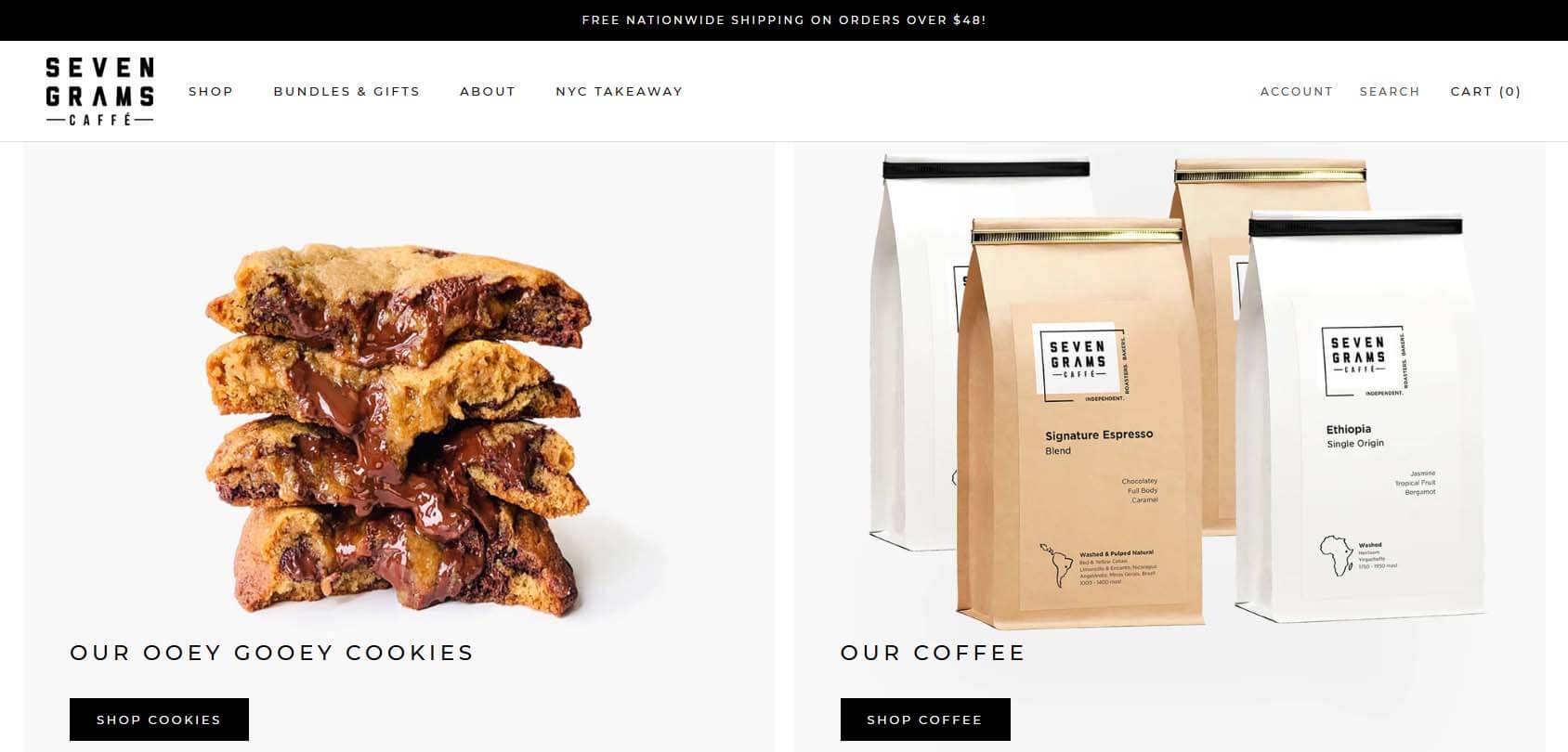
Seven Grams Caffe sells coffee and cookies. It’s a simple online shop showcasing the products that the business offers. The site uses a simple black-and-white theme that gives it a modern yet simple look. Moreover, the minimalistic design allows the products to emerge into the foreground.
- Website description: coffee and cookies store
- Website type: eCommerce
2. The Ancient Mariner
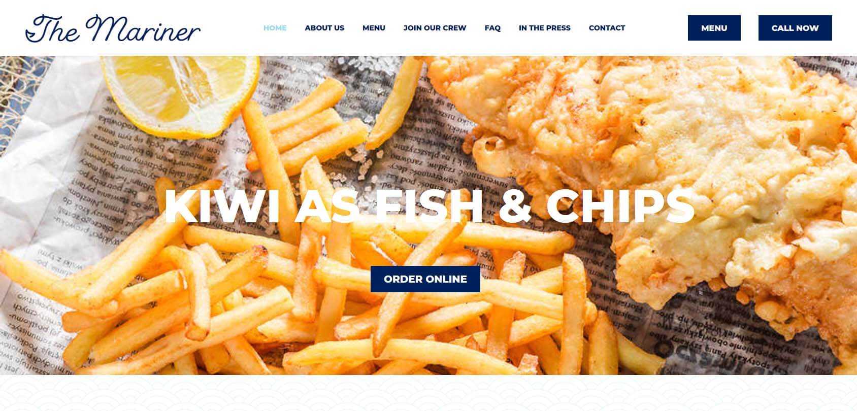
The Ancient Mariner is a restaurant that sells fish and chips made from fish from the local waters of New Zealand. The site’s color palette is dominated by navy blue, reminding visitors that it has something to do with the sea and fish. The simple and effective hero shot shows fish and chips, making it crystal clear what you can expect on the site.
- Website description: fish and chips restaurant
- Website type: restaurant
3. The Grilled Cheese Factory
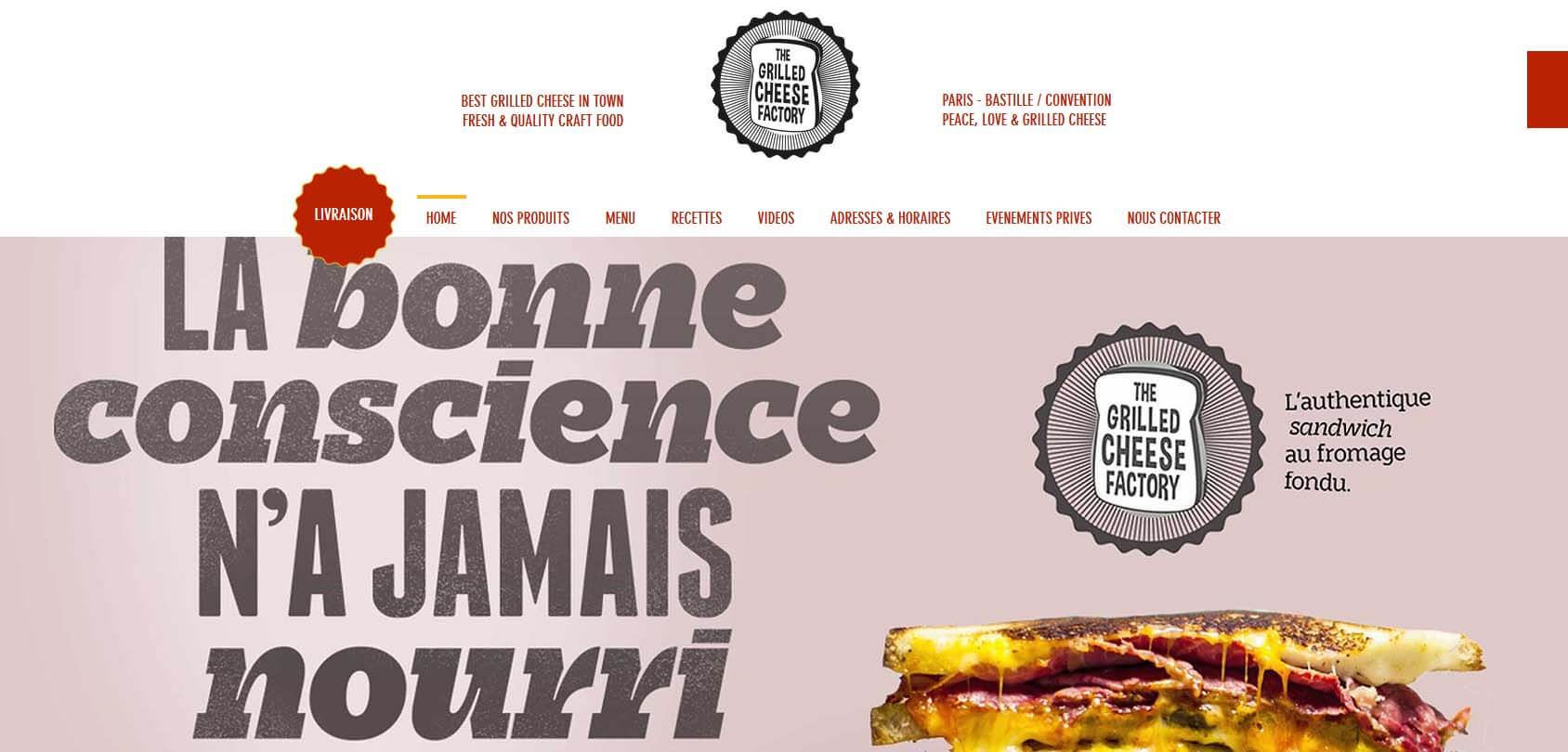
You don’t need to know French to understand what this site is all about. The big picture of a grilled cheese sandwich that pops right up is all that it takes to make you drool all over your keyboard or phone. What really makes this site stand out is the animated video of water being poured on a pile of flour. Check it out!
- Website description: grilled cheese restaurant
- Website type: restaurant
4. Animal Music

Animal Music is highly regarded as one of the best Wix sites due to its outstanding minimalistic design enriched by a great full-screen video that automatically plays once you load the site. Animal is a group of musicians and artists offering original content.
- Website description: a group of musicians’ promotion page
- Website type: portfolio, homepage
5. Adam McCain

McCain’s site doesn’t beat around the bush. As soon as you land, you’ll see who Adam McCain is and everything about his mission. The site actually shows McCain’s life through photographs, where you can learn more about his goal. Although one would expect a somewhat vintage approach to this niche, McCain’s site feels very modern, with various shapes in different shades of gray decorating the homepage.
- Website description: a pastor’s portfolio page
- Website type: portfolio
6. New Energy Colorado
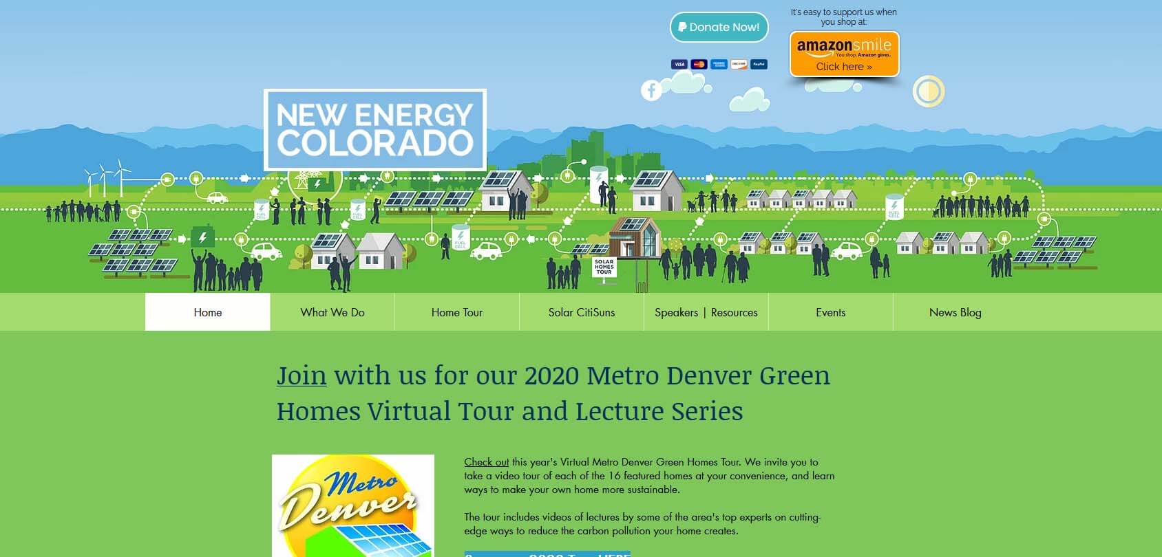
New Energy Colorado is a non-profit organization advocating green energy. Although the site looks pretty outdated, it’s still a great example of portraying your beliefs and your work through a design. The greenish homepage and the fantastic illustration of a green community are enough to know what type of site you’re on.
- Website description: a non-government organization presenting its eco-friendly beliefs
- Website type: homepage
7. The Sofia Log
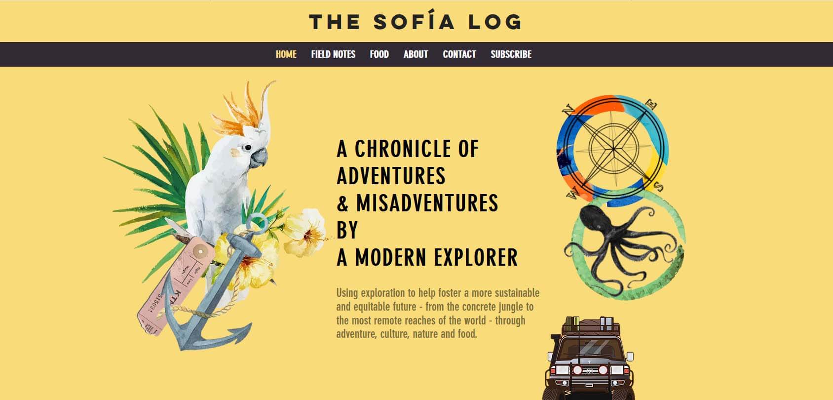
Sofia is a former ballet dancer who decided to travel worldwide, sharing her field notes and various food recipes from the countries she visited. The site uses the combination of cream, white, and dark brown to portray her adventures and suggest what kind of journey we can expect to see in her blog.
- Website description: Sofia shares her adventures in a travel blog
- Website type: travel blog
8. Oli Dillon
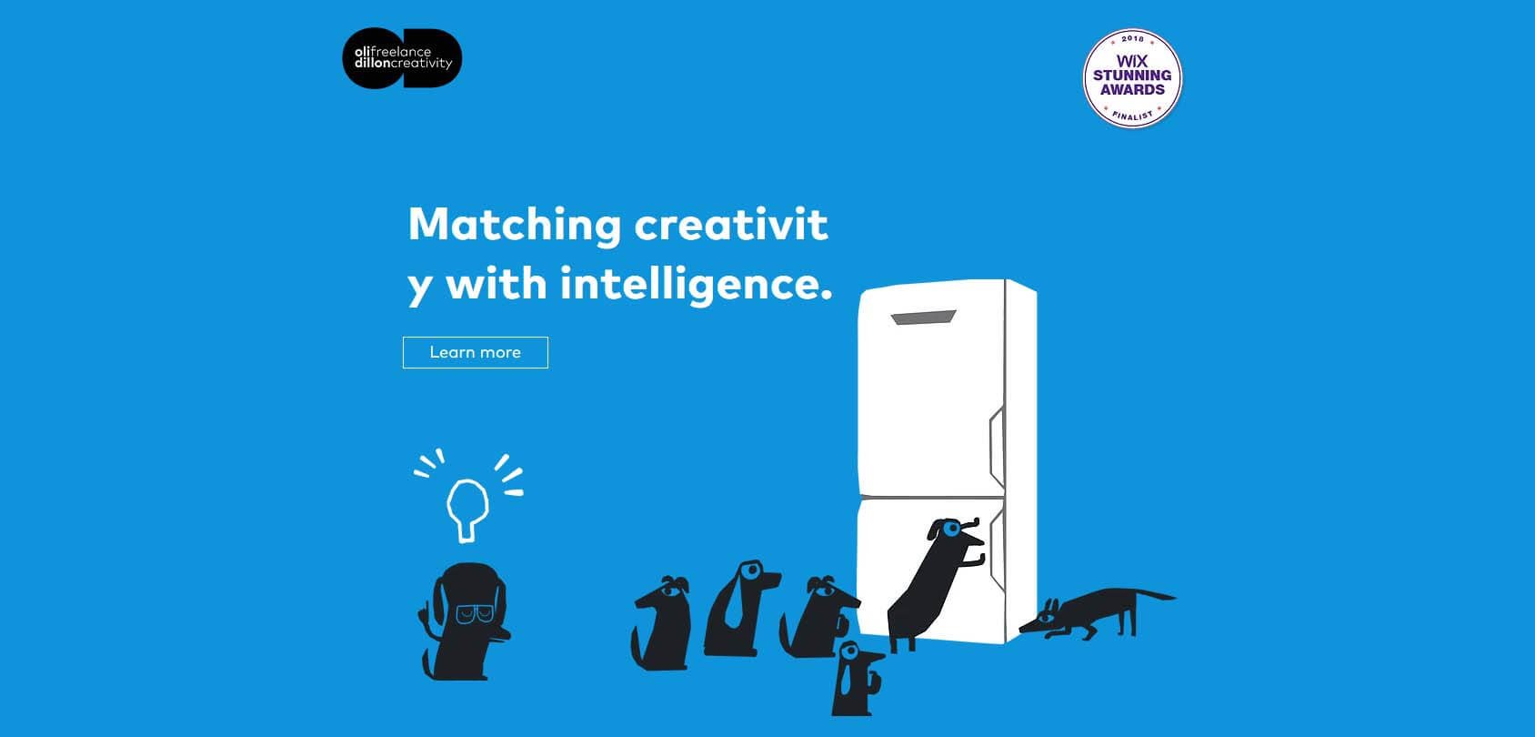
Oli Dillon is a freelance graphic designer with a charming approach. His style is evident as soon as you land on his great site which is completely dipped in blue. This site was a finalist in the 2018 Wix Stunning Awards. It’s one of the finest examples of how beautiful a site can be if you use the Wix website builder and a dash of creativity.
9. Eat Live Sleep
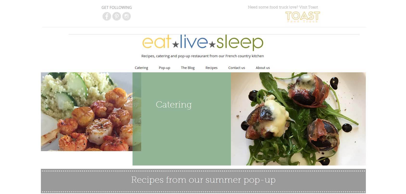
Eat Live Sleep is a site founded by Celine Issitt, a famous Interior Architect who wanted to share her passion for food, meaning you can find plenty of posts about catering, recipes, and her pop-up restaurant. The colors on the site match the dominant colors of the food Celine makes, giving Eat Live Sleep a nice touch.
- Website description: a pop-up restaurant, recipes, and catering
- Website type: food blog
10. Sonja van Duelmen
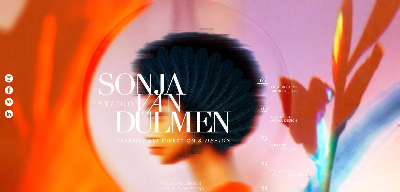
Sonja van Duelmen is a creative art director and designer who offers many services, including image branding, corporate design, photo-editing, and more. Her site feels sort of alive, as Sonja has adopted this experimental approach to design that’s bound to keep your attention with various silhouettes moving in the background. Moreover, there are many of animated pictures on the site that are pure art.
- Website description: a design and photo editing website of a professional designer
- Website type: portfolio
11. Thank God It’s Monday
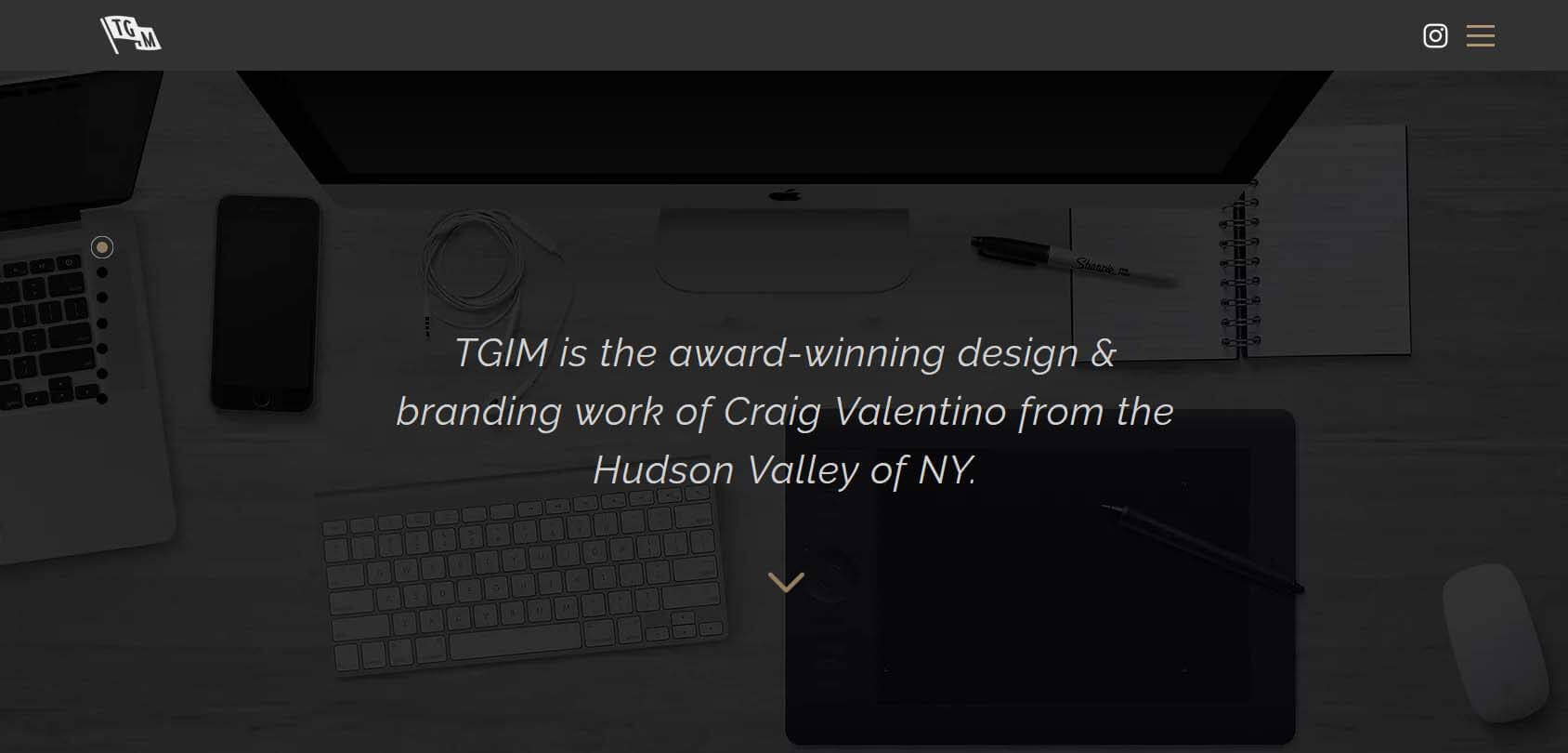
TGIM is the portfolio website of a famous NY-based designer, Craig Valentino, who has worked with some popular brands, including Puma, Grenade, and Pepsico. The site is an excellent example of what a professional designer can create with Wix. Although simple, Valentino’s platform offers a great overview of his work that you’ll enjoy scrolling through.
- Website description: a portfolio of a popular designer
- Website type: portfolio
12. Catrike
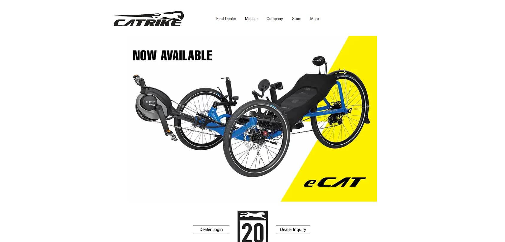
Did you know that you can buy professional tricycles? Catrike is a simple Wix-powered site that tosses you right into the weird yet fantastic world of these fascinating machines. You’re immediately presented with the available products., You can learn more about their features, components, frame, geometry, and more. This is a perfect example of a functional and useful Wix site.
- Website description: a tricycle shop
- Website type: eCommerce
13. Wendy Ju
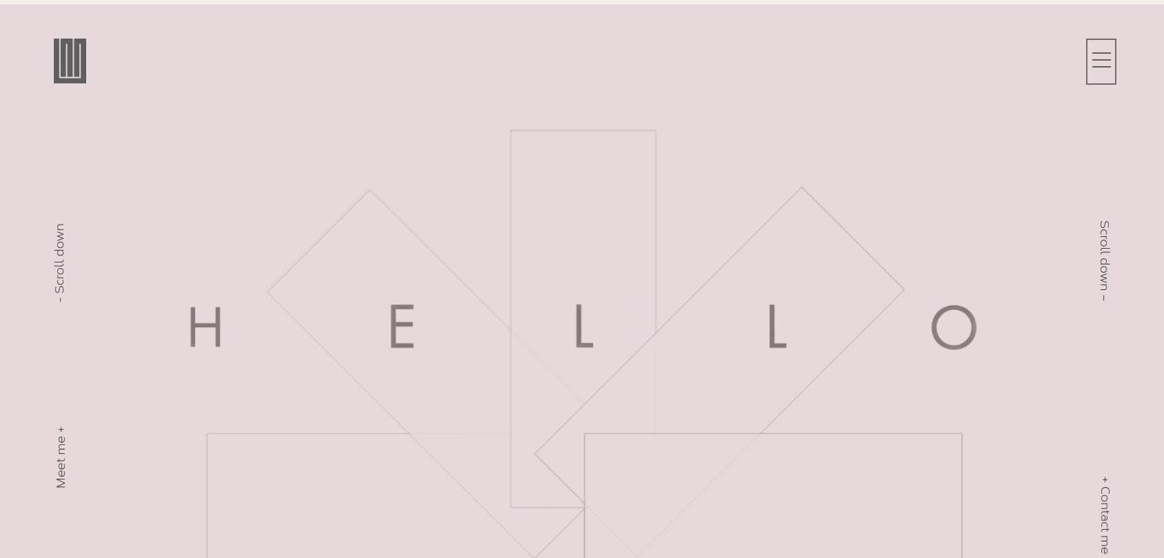
Wendy Ju is a professional graphic designer and a creative person who built her unique portfolio site on Wix. If you’re into arts and design, you’re definitely going to appreciate the unusual yet straightforward approach to this site that welcomes you with nothing but a giant “Hi.”
- Website description: a portfolio of a graphic designer
- Website type: portfolio
14. Karlie Kloss

Karlie Kloss is a popular American model who has been on the cover of Vogue Magazine 40 times. She decided to share her passions and projects with the world, creating a simple Wix-powered site. It looks exactly how you would expect a model site to look. We’ll give you a hint — it has this Voguesque vibe. You know what we’re talking about if you’re a Vogue reader.
- Website description: a personal site of a professional model and activist
- Website type: homepage, portfolio
15. Jennifer Lopez
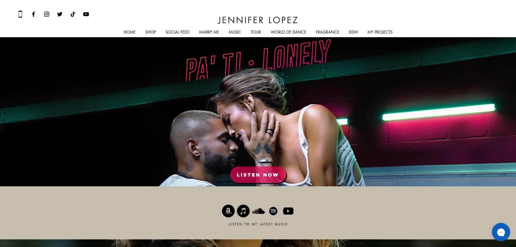
Yes, good old Jenny from the block decided to make her site using Wix. Truth be told, the site design could be better, given that it’s made for a music superstar. However, it’s definitely a great example of how you can stuff all kinds of content into a site using Wix and still make the website look great and load quickly.
- Website description: Jennifer’s official website
- Website type: portfolio, eCommerce
16. Carla Grace Art
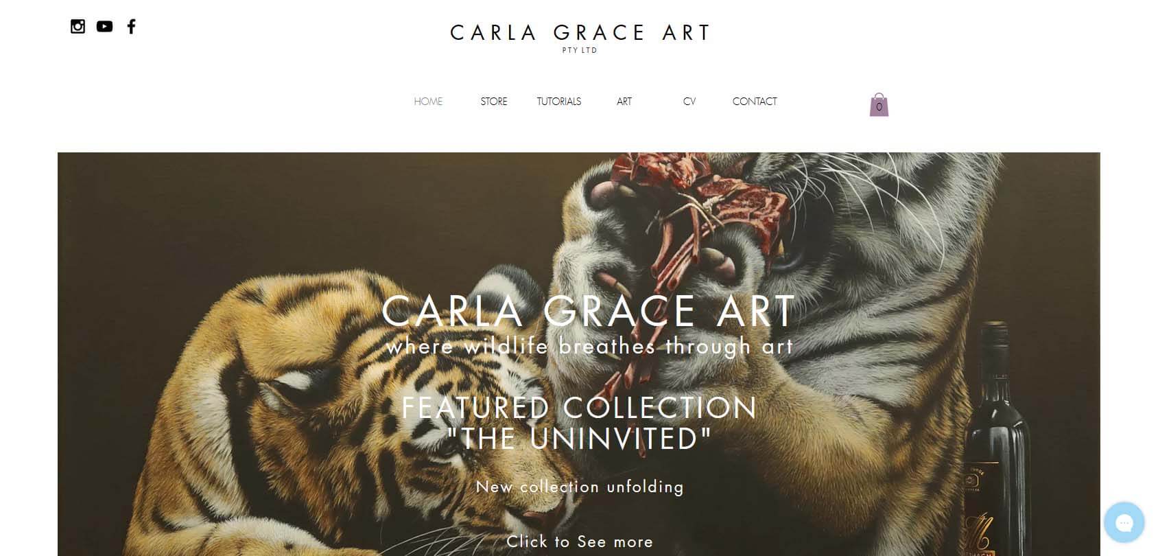
Carla Grace is a professional painter who focuses on making hyperrealistic paintings of wild animals. Even though the site seems to be based on a simple Wix template, it still perfectly showcases her work, making her images stand out. There’s also a store section where you can buy one of her paintings or limited-edition prints.
- Website description: a portfolio and shop of a talented painter
- Website type: portfolio, eCommerce
17. Run Wild Design
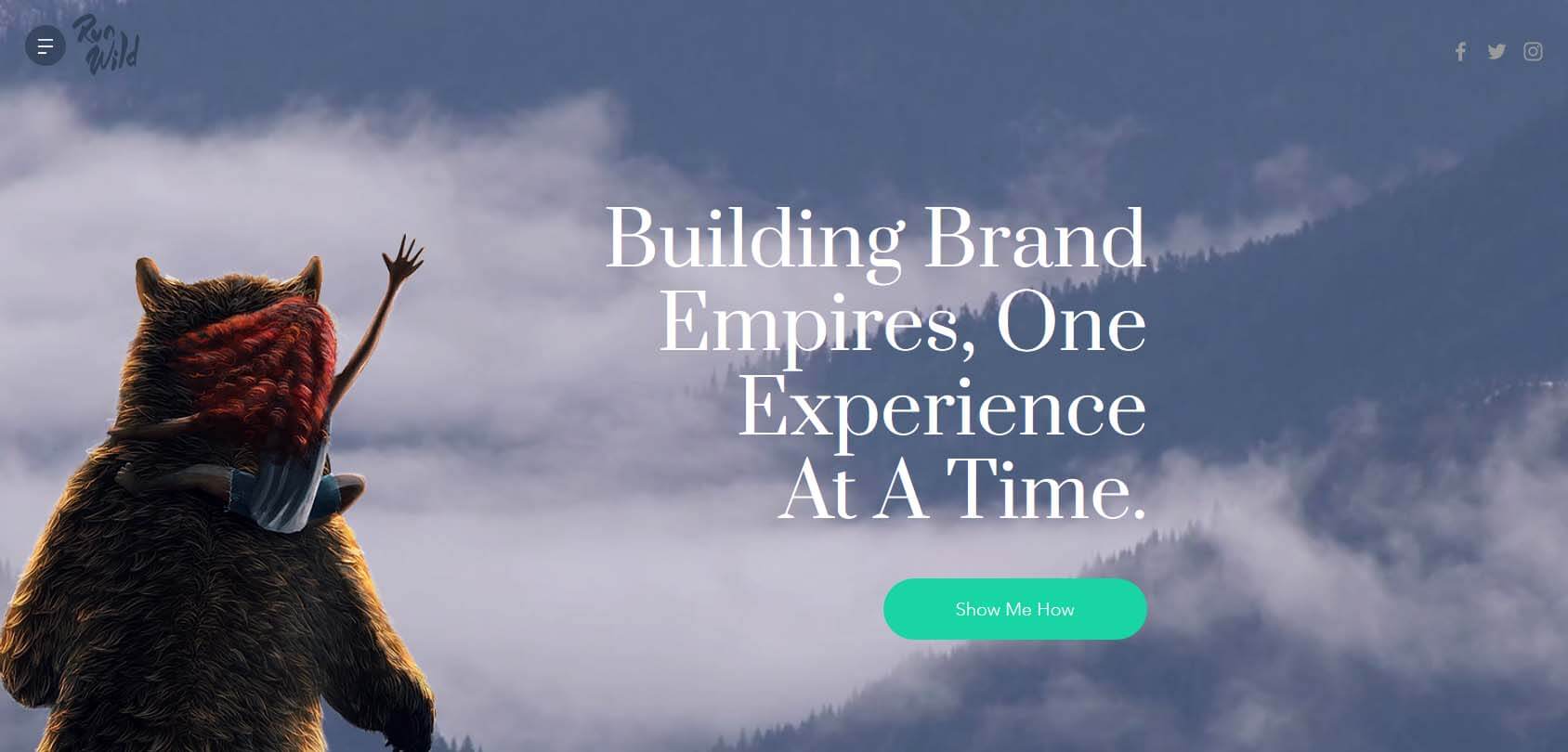
Chris is an exceptional designer who has worked with some of the biggest entertainment companies, including PlayStation. His Wix site is perhaps the most detailed one on this list, with a comprehensive overview of his work in UX, UI, illustration, and more. Run Wild Design is also a perfect example of an effective one-pager, although it also features a separate shop page where you can buy Chris’s work.
- Website description: a portfolio and shop of famous designer and artist’s works
- Website type: portfolio, eCommerce
18. Ravin AI

Ravin is a company that focuses on computer vision and deep learning to inspect the development of vehicles. Its cutting-edge approach is perfectly portrayed by this astonishing, content-filled website that’s drenched in purple, which clearly says — we’re the future of the automotive industry.
- Website description: an official site of an AI company
- Website type: official presentation
19. Kunstrukt
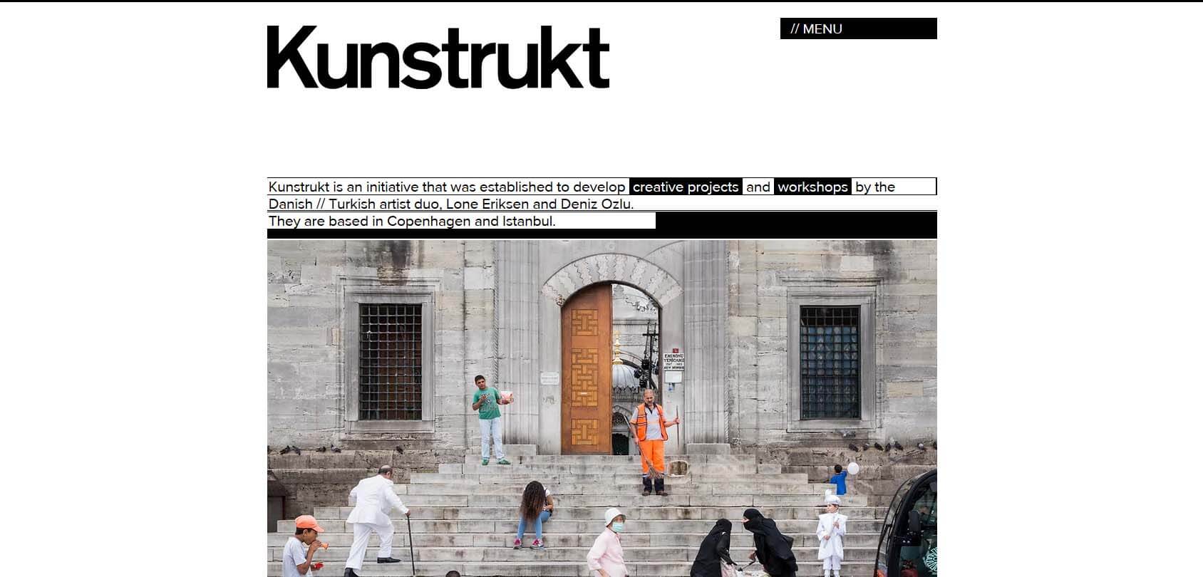
Kunstrukt is the brainchild of Lone Eriksen and Deniz Ozlu, two artists from Denmark and Turkey who decided to showcase their unusual yet fascinating approach to art. As soon as you land on the site, you’ll know what it’s all about. It’s modern, artsy, edgy, yet very effective at portraying two artists’ work.
- Website description: a portfolio of two modern artists
- Website type: portfolio
20. Payton Pitts
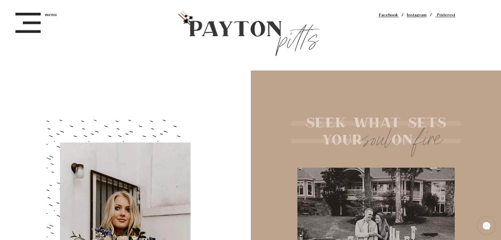
Payton is a traveling photographer from North Georgia, and she has really paid attention to how her site is designed. It’s one of the most inspiring Wix-based sites out there, with a color palette that compliments her work in an effective way. It’s safe to describe the design as vintage with touches of a modern approach to website building.
- Website description: a portfolio of a professional photographer
- Website type: portfolio
21. Rafael Varona
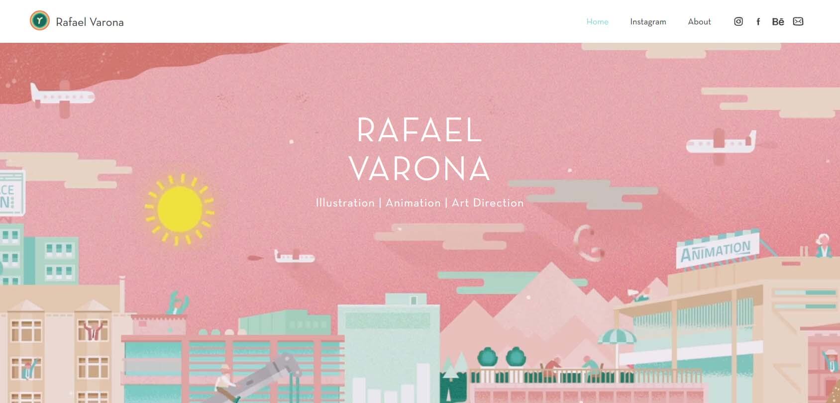
Not many artists manage to grab your attention and draw you into their world in an instant. However, Varona pulls that off effortlessly. Visit the portfolio site for this animator, and you’ll see a lot of happy animated people dancing all over your screen. It’s incredible how well-optimized yet packed with tasteful animations this site is. Scroll down to see more of Varona’s work.
- Website description: a portfolio of a talented illustrator and animator
- Website type: portfolio
22. TerraLiving
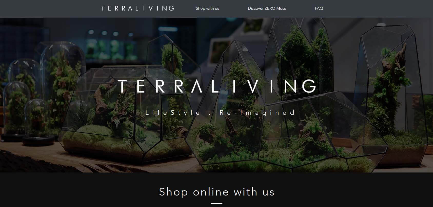
If you have ever wanted to grow moss in a tiny glass greenhouse, TerraLiving offers great options that will decorate your home. Their modern glass design stands out on the minimalistic website of this company.
- Website description: a shop selling miniature greenhouse decorations
- Website type: eCommerce
23. Plastic Freedom
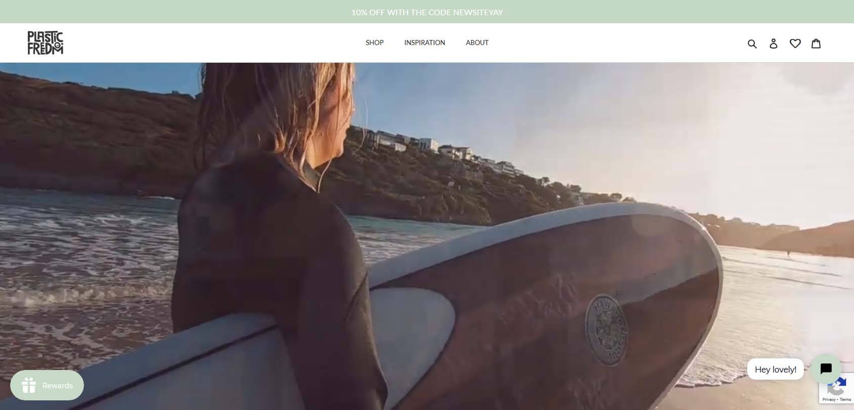
The idea behind Plastic Freedom is to sell completely plastic-free products. Moreover, for every product that you order on the site, a seller will plant one tree. Design-wise, the site gives off this eco-friendly vibe that immediately lets you know what type of content and products you can expect. It’s a perfect example of how to convey information through design.
- Website description: an online shop selling plastic-free products
- Website type: eCommerce
24. Tobias Becs
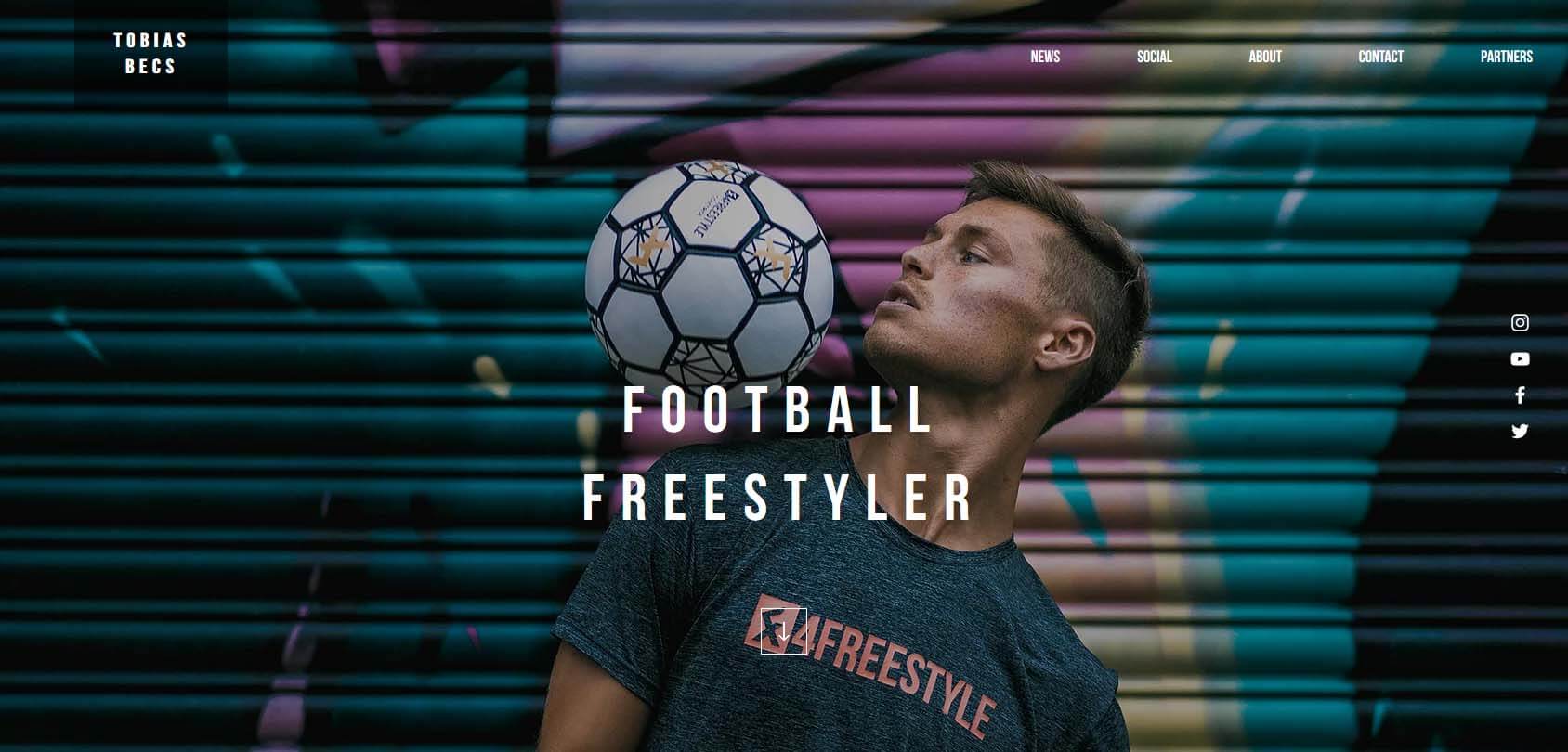
Tobias Becs is a football freestyler, meaning he can do wonders with his ball. However, the site also focuses on his other activities, as it’s basically a blog about this talented athlete. We’ve selected this site not only because it’s visually appealing, but also because it’s a great example of a one-pager with minimal content. Yet, it tells you all that you need to know about Tobias and his adventures.
- Website description: a portfolio and blog of a talented freestyle football player
- Website type: portfolio, blog
25. Le Tigre Tent
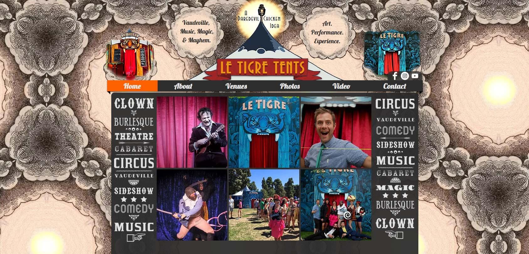
Le Tigre Tent is a company that hosts shows in unique tiger-inspired tents. Their website actually looks like a tent, where you can take a peek at what happens behind the curtains. It depicts the performance art of Le Tigre Tent in a simple and effective way by using Wix.
- Website description: a portfolio page of a performance arts company
- Website type: portfolio
26. Brandon Keehner
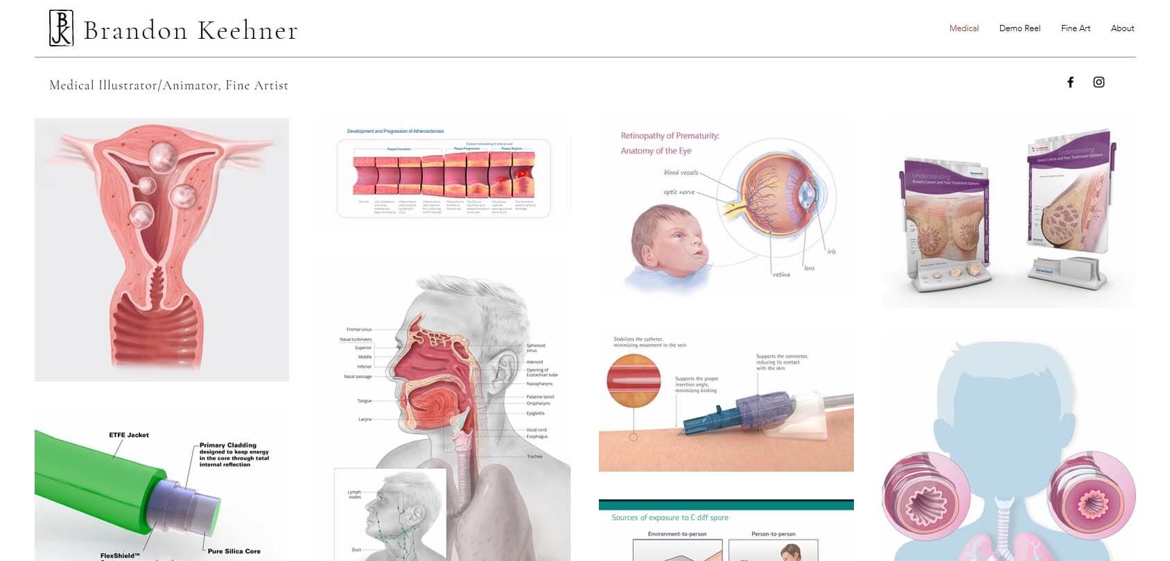
If you visit Brandon Keehner’s site, you might get the impression that he is a doctor, but he is actually a medical illustrator. The images you’ll encounter on his site aren’t lessons for medical students but rather his portfolio. The site instantly drops you into the middle of Keehner’s medical world, where you can learn more about his art.
- Website description: a portfolio of an artist who focuses on medical illustrations
- Website type: portfolio
27. EO
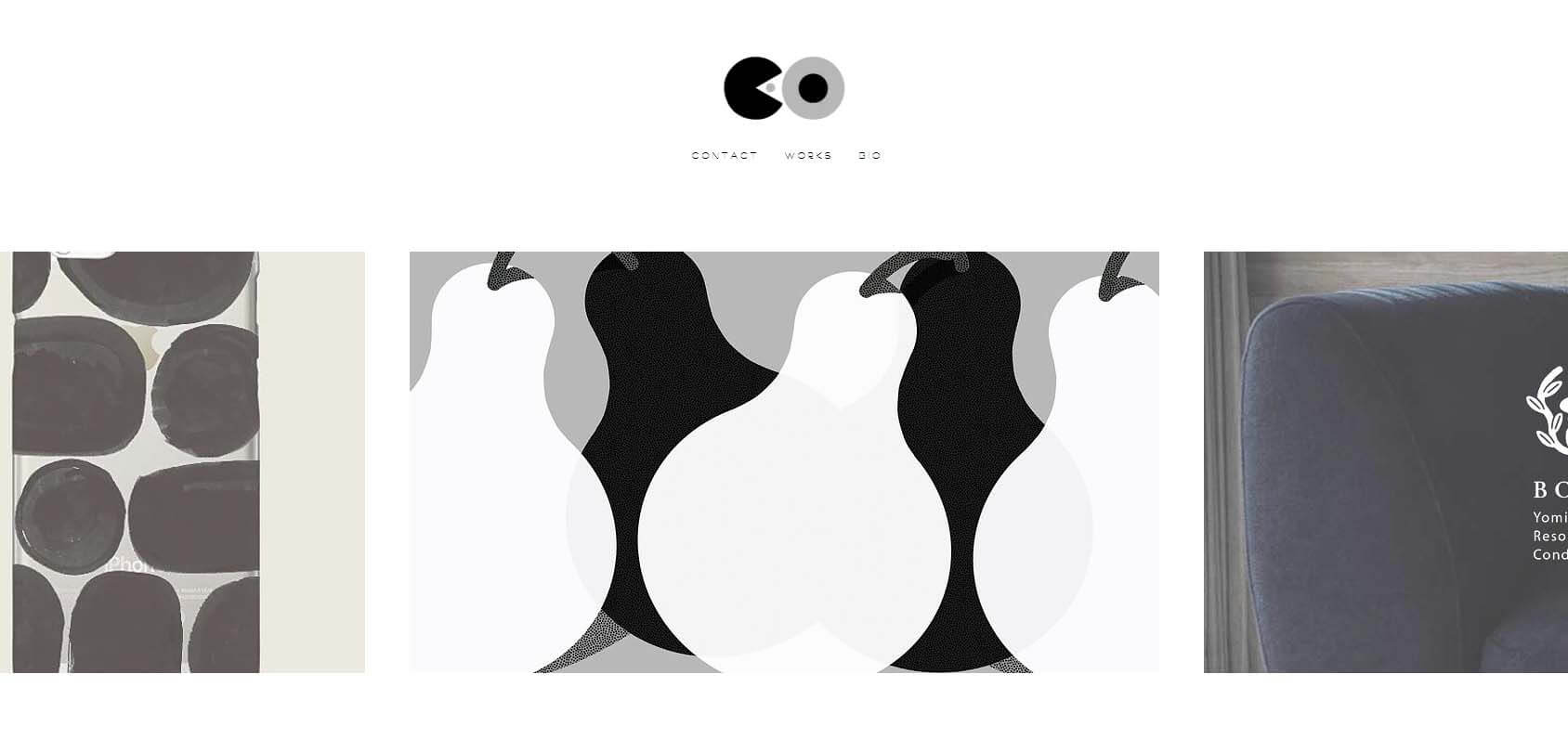
Asuka Eo is a talented artist from Japan, and that’s all you need to know, as her site is a work of art. We will not tell you anything else about the platform — you’ll just have to witness it.
- Website description: a portfolio of an artist
- Website type: portfolio
28. Olive Secret
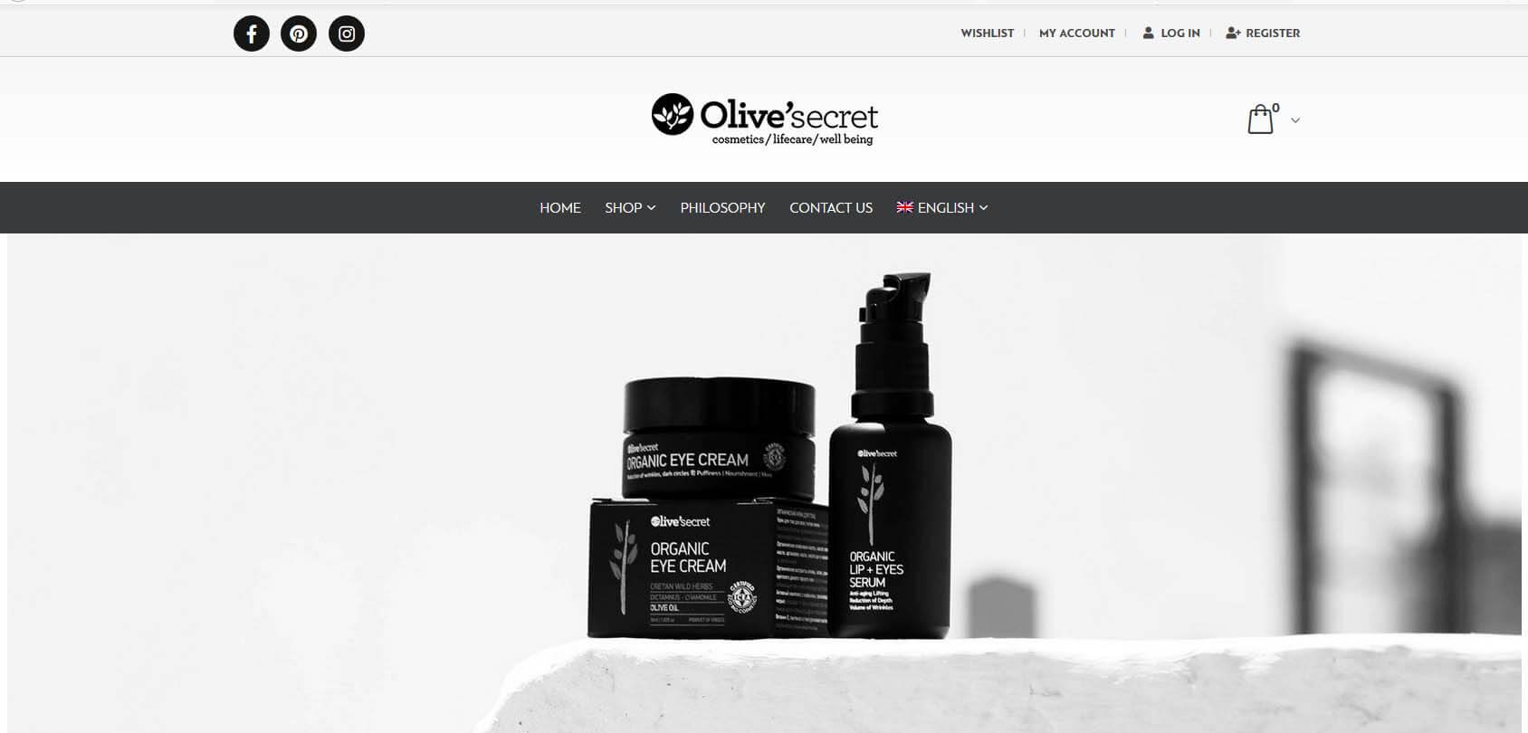
Greeks use olive oil for all kinds of products, and the ones sold at Olive Secret focus on cosmetics, lifecare, and well being. This modern and minimalistic site features an outstanding shop section, which is why we have included this website in our list. Feel free to explore the shop and play around to get an idea of how to build a Wix shop of your own.
- Website description: an online shop selling olive-based products
- Website type: eCommerce
29. Valeria Monis
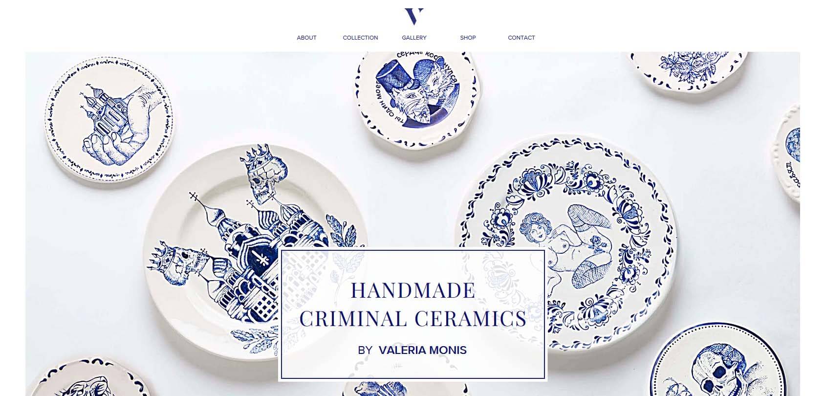
Valeria Monis makes handmade ceramics with a unique design. The site follows color palettes and branding similar to her products, making the two blend perfectly into a masterpiece of a website.
- Website description: an online shop and portfolio for a ceramics designer
- Website type: eCommerce, portfolio
30. Hello Neighbor
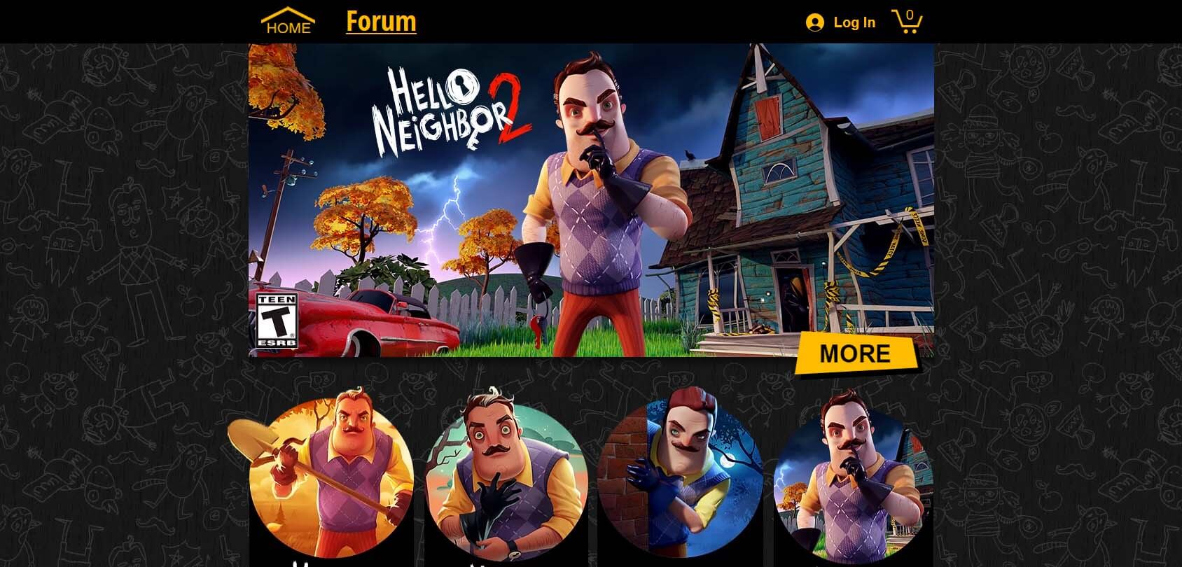
Hello Neighbor is a popular game series, and this site is its official shop where you can buy various collectibles, action figures, and more. The site is a great example of a simple page that does a lot with just a few elements. In addition to that, the design of the website perfectly matches the feeling captured in the game.
- Website description: a shop of a popular game
- Website type: eCommerce
31. Loom AI

Loom AI uses artificial intelligence to help you to create a virtual avatar that you can use for real-time virtual communication. The reason we chose this site is that it perfectly communicates what the company offers. As soon as you land on the website, you’ll see a short video on repeat and immediately understand the purpose of the company.
- Website description: an official site of an AI company
- Website type: homepage
32. The Apothecaries’ Garden
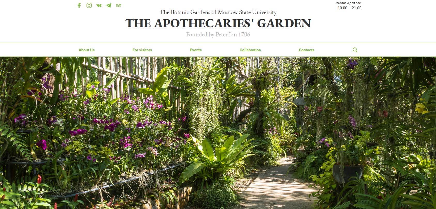
The Apothecaries’ Garden is the official site of Moscow State University’s botanical gardens. The site is very simple, yet it says so much about the gardens. You can understand basically everything that you need, even if you don’t speak a word of Russian.
- Website description: the official site of Moscow State University’s botanical gardens
- Website type: homepage
33. AchieveMore

AchieveMore is another great example of an outstanding one-page approach, where all of the information you need is only one mouse scroll away. If you’re an experienced designer, you might not find some elements aesthetically pleasing, but this site seems to pay more attention to functionality and conveying what it offers than design. The site is in Portuguese. Without translating it to English, would you be able to guess what it’s about?
- Website description: an online presentation of a company
- Website type: homepage
34. Michal Oren Jewelry
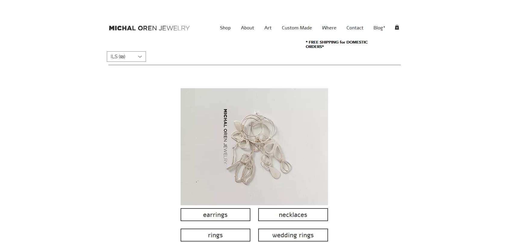
Michael Oren is a talented jewelry maker, and this site is both her portfolio and online shop. Created by Wix, it uses minimalistic design in a simple way — something that you can do in minutes via the website builder. However, all of the website’s elements make perfect sense, giving it depth and pleasing our aesthetic cravings.
- Website description: an online shop and portfolio for a jewelry designer
- Website type: eCommerce, portfolio
Conclusion
Hopefully, these examples have inspired you to make a Wix website on your own. Even if you have already started working on a site, these examples should give you a creativity boost to create a unique site with Wix.
Making a Wix site has never been easier. As you can see in our examples, all you need is some effort and creativity, and you can do wonders, so make sure to give Wix a try!
